


.png)


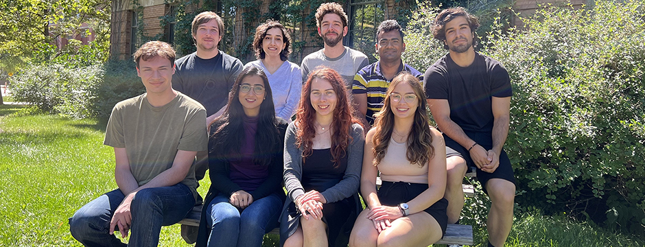
Students and professors working in the lab are committed to exploring new and innovative research areas in human-computer interaction.
We are currently carrying out research in a number of a different fields including:
-
Learning technologies
-
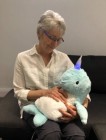
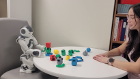
Human-robot interaction
-
Online communities
-
Technologies for older adults
-
Creativity-support tools
-
Human-AI interaction
-
Several other areas of HCI research
News & Announcements
March 11, 2022 | Best Paper award at HRI 2022
Congratulations to James Berzuk and Dr. James Young for winning the Best Paper Award in the Theory and Methods Category at the 2022 ACM/IEEE International Conference on Human-Robot Interaction!
July 04, 2020 | Honourable Mention award in CHI 2020
Congratulations to Teng Han, alumnus, for winning the Honourable Mention award in 2020 the ACM conference on Human Factors in Computing Systems(CHI 2020)!
December 10, 2019 | More Awards Winners
Congratulations to Ananta Chowhury for receiving a University of Manitoba Graduate Fellowship (UMGF) to support her M.Sc. research. Congratulations also to Daniel Rea and Stela Seo, each of whom received an NSERC/Japan Society for the Promotion of Science Postdoctoral Fellowship. Best of luck to Ananta, Daniel and Stela!